01
It cannot hold a bright colour
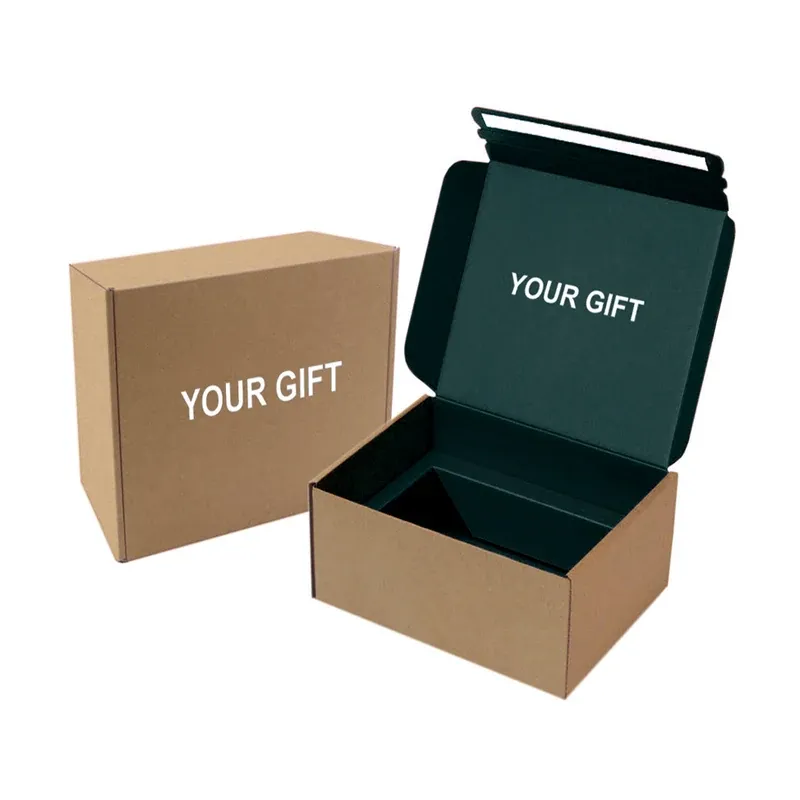
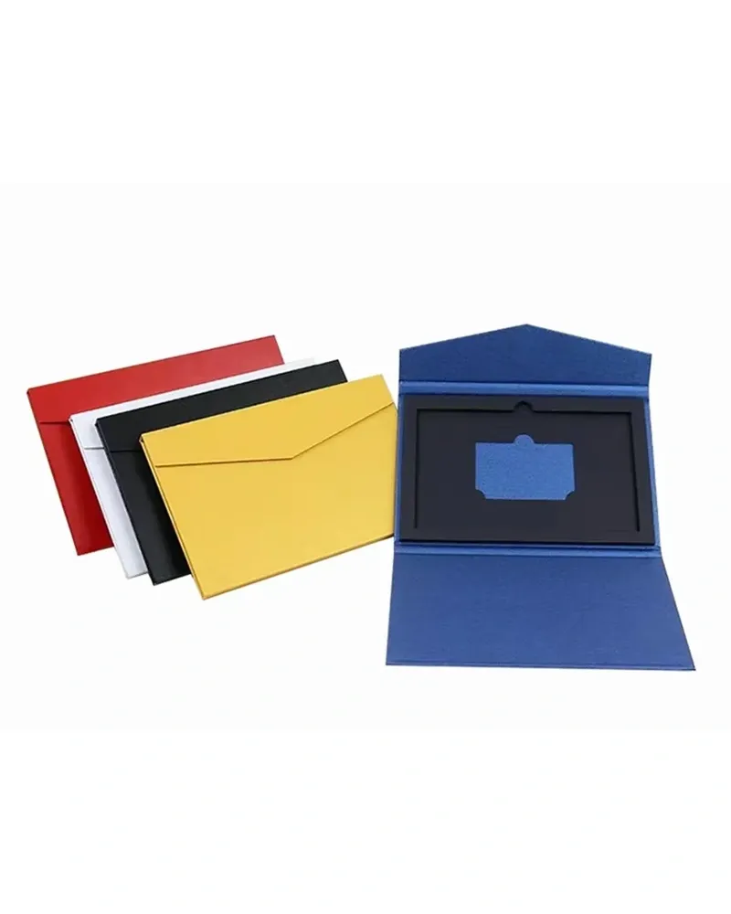
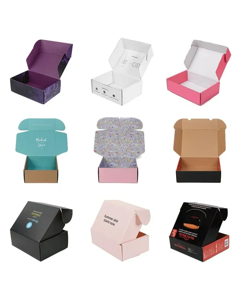
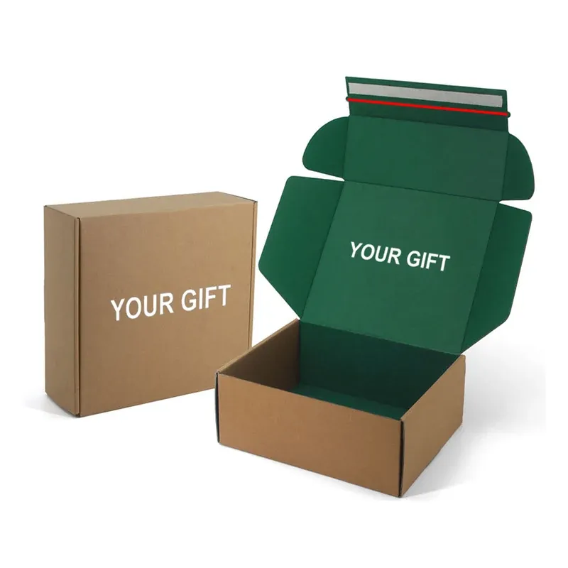
Brown is not a neutral base. A pale or saturated colour printed on kraft shifts darker and warmer, so a brand colour that matches on white will not match here. Pantone on kraft is matched to the board, not to the swatch book.
02
It cannot be spotless
Recycled and natural fibres vary between batches, so the shade moves slightly from run to run. If two parts of a set have to match exactly, print them on the same sheet.
03
It cannot be both uncoated and glossy
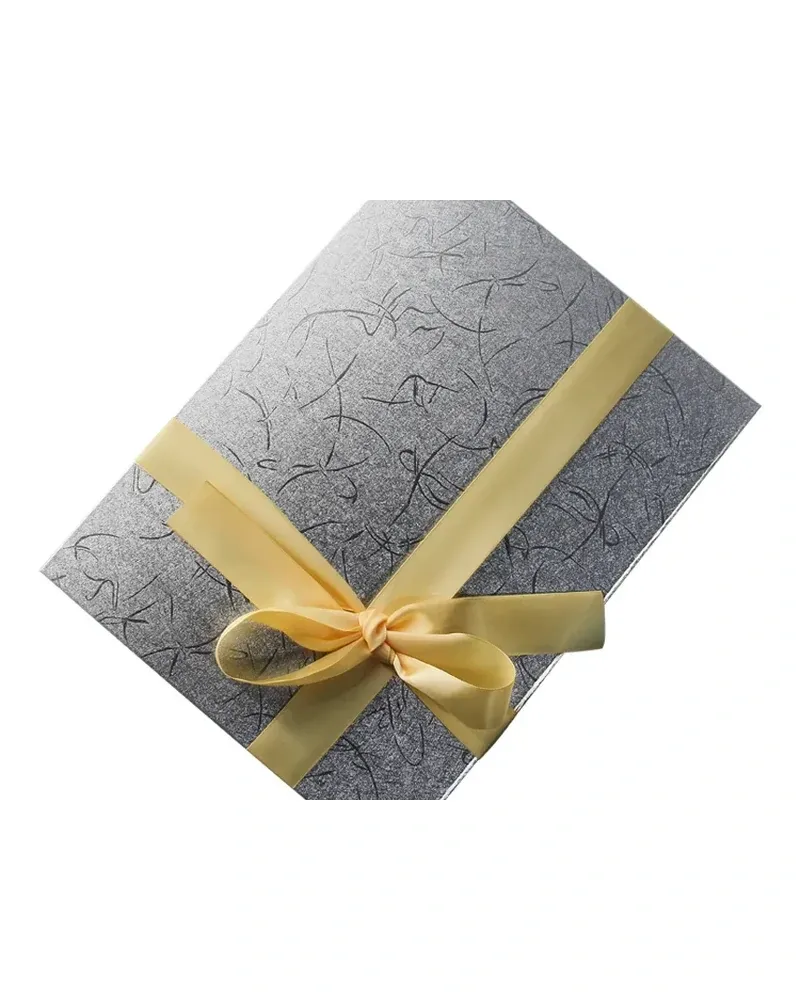
A matte or soft-touch film gives kraft a premium feel and a plastic layer at the same time. Choosing kraft for the material usually means leaving the film off.
04
It cannot carry fine detail at small sizes
Uncoated board absorbs ink, so hairlines and reverse-out type below about 6 pt fill in. Bold marks and solid shapes are what kraft prints well.