Buying Guides
Custom Packaging Color Match on Kraft: Getting It Right the First Time
Why brand colours shift on kraft, what's achievable, the seven-line print spec (Pantone C/U, white underprint, Delta E, D50), and how to hold reorders to a golden sample.
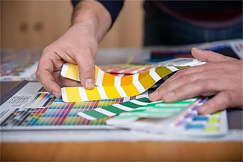
A brand colour printed on kraft will not match the same colour printed on white coated board, and no amount of arguing will make it. Kraft is unbleached brown paper: the base hue shows through translucent ink, the fibers absorb it, and the result shifts warmer, darker, and duller. A bright teal approved on a screen can come back a murky olive. The ink was mixed correctly; the substrate changed what you see.
This is the single most common colour complaint in custom packaging, and it is almost never a printing fault. It is a specification gap: the colour reference, the stock, the finish, the proof type, and the tolerance were never written down together. Fix those five things and "close enough" stops being a matter of opinion.
This guide is the buyer-side method for colour on kraft and other uncoated stock: what physically happens, which colours are achievable, how to write a print spec, and how to hold reorders to an approved physical standard. For the label-stock decision see Clear vs kraft label, and for the artwork pre-flight see Packaging artwork check.
Key Takeaways
Kraft's brown, absorbent base shifts ink warmer and duller; a screen or a PDF proof is not a colour reference. See Packaging artwork check.
Specify Pantone with the C/U suffix and the stock by name and weight. "Pantone 285" without a suffix and substrate is two guesses at once.
Bright, saturated colours need an opaque white underprint on kraft — an extra ink unit with a cost and a limit. Dark blacks, deep browns, forest greens, and foil work directly on kraft.
Judge colour on a physical drawdown on the production substrate, under standard D50 lighting, with an agreed Delta E tolerance. Confirm the current revision of any tolerance or standard with your quality team in writing.
Keep an approved physical golden sample; reorders match the sample, not a fresh file. See Golden sample custom packaging.
Why kraft changes the colour
Three mechanisms stack up:
Base hue. Unbleached kraft is brown. Unless the ink is very opaque, the substrate shows through and tints everything toward warm brown. Mid-saturation brand colours lose their edge; cool blues and bright whites suffer most.
Absorption. Coated board holds ink on the surface, so colour stays crisp and saturated. Kraft and other uncoated stocks drink ink in, so the same formula prints softer, darker, and duller, with dot gain. That is why Pantone publishes coated (C) and uncoated (U) versions of the same number — they genuinely are not the same colour.
Finish and light. A matte laminate mutes and slightly lightens; a gloss film deepens and saturates; soft-touch shifts again. And two colours that match under one light can disagree under another — metamerism. Print is judged under standard D50 lighting precisely because a desk lamp, a showroom fluorescent, and daylight give three different verdicts. See Barrier coatings paper packaging for how coatings also change the surface.
Then there is the screen itself. A monitor emits RGB light; print reflects CMYK ink. An uncalibrated laptop, phone, and factory monitor all render the same file differently. "Match what I see on screen" is not a spec.
Have a brand colour you need on kraft? [Send us the Pantone reference and the stock →] We'll tell you in writing whether it is achievable directly, needs a white underprint, or should be redesigned for the substrate — free on the first review.
What is achievable on kraft
Be honest about the palette before the artwork is final:
Colour intent | On kraft | What it needs |
|---|---|---|
Black / dark charcoal | Reads well | Usually direct, opaque ink |
Deep brown, forest green, navy | Reads well | Direct, reasonably opaque |
Metallic foil (gold, copper) | Excellent | Foil, not ink — see Custom packaging stickers |
White / light pastels | Poor without help | Opaque white underprint |
Bright saturated brand colours | Limited | White underprint, and still a narrower range than on white board |
Neon / very light tints | Not realistic | Choose a different stock or a label |
Photographic full colour | Muted | CMYK on kraft is dull; consider a printed label on white stock |
The white underprint (sometimes called a flood or underbase) lays opaque white ink under the spot colour to create a neutral surface. It adds an ink unit to the press setup and a per-unit cost, and it still cannot make kraft behave like bright white SBS. If your brand identity depends on a vivid colour and you also want the natural kraft look, that is a real tension — settle it before production, not after the first container. See Custom packaging sample kit for requesting a drawdown with the underprint shown.
An alternative worth considering: keep the kraft box unprinted or simply marked, and put the brand colour on a label printed on white stock. See Clear vs kraft label and Custom label manufacturer. You get the natural look and an accurate logo without fighting the substrate.
Write the print spec: the seven lines
A colour dispute is almost always a missing line. Put all seven in the PO:
Colour specification checklist
Exact Pantone reference with the C/U suffix and the swatch-book reference stated (guides are updated; note the edition).
Whether each colour is a spot ink (separate plate) or a CMYK/Color Bridge approximation — never "either is fine".
Substrate by name and weight (e.g. unbleached kraft, specified gsm), including the finish (matte, gloss, soft-touch, varnish).
Whether an opaque white underprint is required, and on which colours.
An agreed Delta E tolerance for the match (commonly a low single-digit value for brand-critical spots) — confirm the current revision of the method with your quality team in writing.
Proof type: a digital proof for layout/content, plus a physical drawdown or press proof on the production substrate for colour sign-off.
Lighting condition for review (D50 is the print-industry standard) and who owns sign-off.
Add two more that buyers forget: which colour is sacred (the logo red) versus which has room to move (the background), and what a reorder is matched against. A busy design is easier to hold when the factory knows where to spend the tolerance budget. See Packaging proof approval process for the sign-off gate.
Need the drawdowns before you approve artwork? [Request a free kraft colour sample set →] Our Dongguan team will draw your specified colours on the actual stock, with and without a white underprint, and hand you the physical references — ~5-day free samples on most custom runs.
Mini story: the teal that turned olive
A coffee brand run by Priya chose a natural kraft carton and specified "Pantone 319" — a bright teal — from a swatch book she had been given on coated reference paper. The digital proof looked right on her laptop. No suffix, no substrate, no physical drawdown, no tolerance.
The first 6,000 cartons came back a muted green-brown. The factory had printed exactly the ink requested on exactly the kraft she had chosen; the brown base had simply done what brown bases do. There was nothing to reject against — the PO had no physical standard — so the reprint was a negotiation, and the launch slipped.
The second attempt was procedural. She restated the colour as a spot with the uncoated suffix, accepted that the bright teal was not achievable on raw kraft, and chose one of two paths: an opaque white underprint under the logo, or a printed label on white stock applied to the kraft box. She picked the label. A physical drawdown and an approved golden sample were filed with the spec, and the reorder six months later matched. Her note: "I specified a number. I should have specified a surface."
For the artwork-file side see Packaging artwork check, and for how a supplier's design support handles dieline adaptation see Packaging design tool vs designer.
Measurement, tolerance, and the honest limit
Colour is a range, not a point. Even two runs of the same job, weeks apart, vary slightly — ink batch, temperature, humidity, press conditions, dot gain. The industry expresses the distance as Delta E; a small value is normal and invisible to most eyes. A supplier promising a flawless, zero-variation match on CMYK printed on kraft is either being generous with the truth or does not understand their own process. Confirm the current revision of the tolerance method with your quality team in writing.
What a serious converter does differently:
Measures with a spectrophotometer, not by eye.
Judges under D50 lighting (or the agreed condition), not an office desk.
Supplies a physical drawdown on the production substrate before plates are cut.
Keeps your approved standard on file and matches reorders to it.
Says honestly, before printing, when a colour cannot be hit on the chosen material.
Then freeze it. A golden sample with the colour reference, substrate, finish, tolerance, and lighting condition written into the spec is what makes a reorder match — see Golden sample custom packaging. Add a no-substitution clause: a cheaper kraft lot with a different base shade will shift every colour on the box. Verify the first bulk lot against the sealed sample before it ships; see Pre shipment inspection custom packaging.
Where kraft colour fits the wider program
Three adjacent decisions interact with this one:
Label vs direct print. If the brand colour is critical, a white-stock label on a kraft box often beats fighting the substrate. See Clear vs kraft label and Custom label manufacturer.
Coatings and barriers. A dispersion coating or varnish changes how the surface takes ink and how the colour reads under light — see Barrier coatings paper packaging.
Claims on the box. Kraft is often chosen for a "natural" look, which invites vague eco language. Keep the claim as verifiable as the colour spec — see Eco packaging greenwashing.
And do not let a colour project break the structure: a white underprint, a laminate, or a different label stock can change panel stiffness and closure fit. Approve on the finished production sample, not a flat sheet. See How to evaluate packaging sample.
Conclusion
Custom packaging colour match on kraft is a specification problem, not a printing miracle. The brown, absorbent substrate shifts ink warmer and duller; screens and PDF proofs are not references. Write the seven-line print spec — Pantone with C/U, spot vs process, substrate by name and weight, white underprint, Delta E tolerance, physical proof on production stock, and D50 lighting — and choose a palette that works with the material or put the brand colour on a white-stock label. Measure with a spectrophotometer, accept a tolerance, and freeze an approved golden sample with a no-substitution clause.
Do that and the box that reorders next year is the box your customers photographed this year. For the label decision see Clear vs kraft label, and for artwork pre-flight see Packaging artwork check.
Get your colour specified on the real substrate → Our Dongguan team has delivered 1,000+ custom packaging projects to buyers in 80+ countries since 1998, with verifiable ISO-quality chain, transparent no-hidden-fee quoting, and physical drawdowns on production stock before bulk.
FAQ
Why does my brand colour look dull on kraft? Kraft is unbleached brown and absorbent. The base hue shows through translucent ink and the fibers soak it up, shifting colour warmer, darker, and less saturated. Choose dark colours, use an opaque white underprint, or print the logo on a white-stock label.
What is a white underprint? A flood of opaque white ink laid under the spot colour to create a neutral surface on kraft. It adds an ink unit and cost, and it still cannot make kraft behave like bright white coated board.
What should be in a colour spec for kraft packaging? Pantone with C/U suffix, spot vs CMYK, substrate by name/weight and finish, white underprint requirement, an agreed Delta E tolerance, a physical proof on the production stock, and D50 review lighting. Confirm the current revision of any tolerance method with your quality team in writing.
Why do I need D50 lighting? Colours that match under one light can disagree under another (metamerism). D50 is the print-industry standard for judgement, so buyer and factory reach the same verdict. A desk lamp is not a reference.
Consistency is a plant capability, not a promise. Our pressmen calibrate Pantone matches on uncoated kraft every shift inside a 5,000 m² facility, and 100 staff keep the same drawdowns, substrates, and golden samples on file for reorders. Kraft stocks are FSC-ready, so a colour spec and a responsible-forestry claim can share one sheet. If a later lot drifts from the approved standard, the 60-day remedy window puts the remake on us. That discipline has held since 1998.
How do I keep reorders consistent? Approve a physical golden sample with the colour, substrate, finish, tolerance, and lighting written into the spec, add a no-substitution clause, and verify the first bulk lot against the sealed sample. See Golden sample custom packaging.