Buying Guides
Pantone Color Mismatch: How to Spec It Out
Pantone Color Mismatch: How to Spec It Out: A skincare brand specified Pantone 186 C for its cartons. The first run was right. The second run, six... Specs, MOQ
A skincare brand specified Pantone 186 C for its cartons. The first run was right. The second run, six months later, came back visibly warmer — not orange, not pink, but wrong enough that the retail buyer noticed under the store lights. A Pantone color mismatch is rarely a printing failure; it is usually an unspecified substrate.
Nothing had been substituted. The board was the same grade, the ink was mixed from the same Pantone reference, and the press was the same press. What had changed was the thing nobody had written down: which substrate the color was approved on, and how far it was allowed to drift.
At boxeschina, color is the most common rework trigger we see — more common than structure errors, across 1,000+ projects since 1998 — and it is almost always a specification problem rather than a printing problem.
This guide is about writing a color spec that a printer in another country can execute, and that you can measure when the cartons arrive.
What a Pantone Number Actually Specifies
A Pantone Matching System number is an ink mixing formula, not a fixed, substrate-independent color. The number tells the printer which base inks to blend and in what proportions. What lands on the sheet then depends on:
The stock — coated, uncoated, kraft, recycled, film-laminated, or a grey-board wrap Ink film weight — how thick the ink sits on the sheet Press conditions — rollers, dampening, speed, operator The base coat — whether a white hit sits under the color The finish — matte film darkens and desaturates; gloss film boosts saturation; varnish shifts it slightly
So "Pantone 186 C" is a *recipe*, and the recipe produces a family of acceptable results, not one result. Your spec has to define which member of that family you will accept.
C, U, and Why the Suffix Is Not Decoration
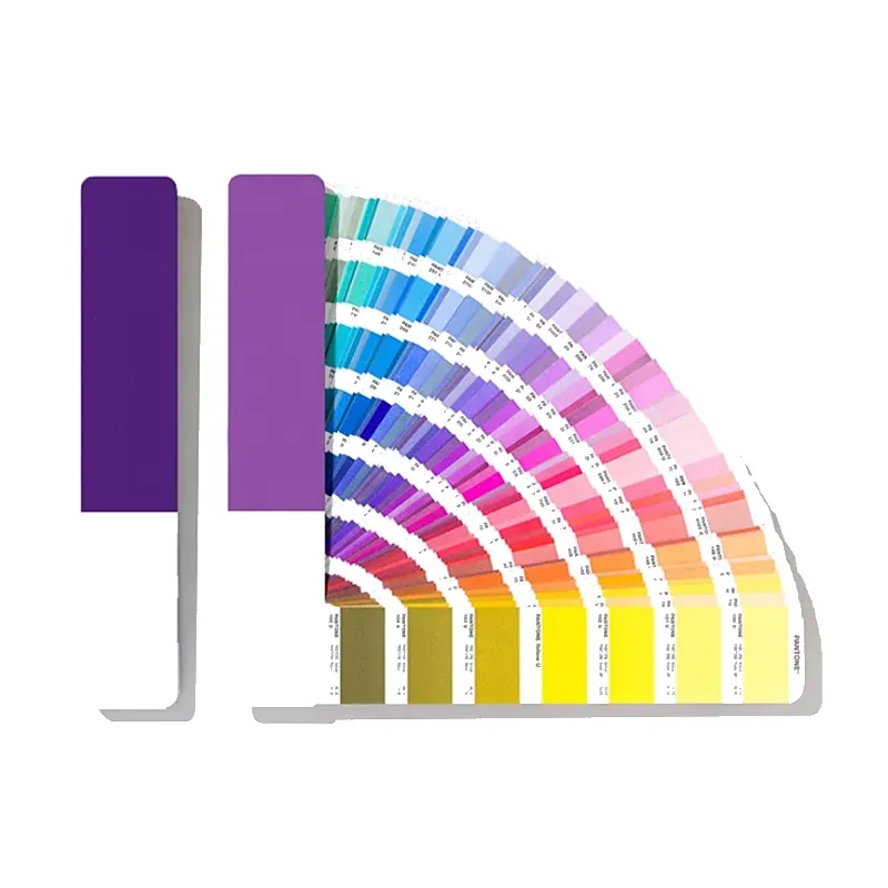
Pantone publishes separate guides for coated and uncoated stock, and the same number looks materially different on each.
In practice the ranges work out as follows. Suffix: C; Meaning: Coated; What happens in practice: Ink sits on the coating; higher gloss, more saturated, tighter dot gain. Suffix: U; Meaning: Uncoated; What happens in practice: Ink absorbs into the fiber; lighter, duller, warmer, more dot gain. Suffix: M; Meaning: Metallic / special; What happens in practice: Different ink system; must be matched with a physical swatch.
A "C" reference printed on an uncoated kraft box will not look like the chip. That is not a printer's error; it is physics. Write the suffix, and write the stock the suffix assumes.
Two habits prevent most of this:
Specify the Pantone number, the suffix, and the substrate in one line. "Pantone 186 C on 350 gsm coated bleached board, one side coated" is a specification. "Pantone 186" is a wish. Do not convert a coated reference to an uncoated stock without approving a drawdown. The conversion is a judgement, not a formula.
Where a Pantone Color Mismatch Comes From
Six causes, in rough order of how often they cause a rejected run.
1. Substrate change
The most common and the most avoidable. Coated white board, uncoated board, kraft, recycled grey-back and film-laminated stock each render the same ink differently. Kraft is the worst offender: its brown base drags every color warm, and light tints go muddy.
Fix: lock the stock in the PO, including mill and grade where possible, and require written notice before any substitution.
2. No white base coat
Printing a bright color directly onto kraft or dark board produces a muted, dirty result. A white hit underneath restores the intended hue — at the cost of an extra pass.
Fix: specify the white hit explicitly for any color printed on kraft, dark or recycled stock. If the supplier proposes skipping it to save a pass, that is a spec change, not an optimisation.
3. Lamination and varnish
Matte film lamination deepens darks slightly and desaturates brights. Gloss film increases apparent saturation. Spot UV creates local contrast that makes adjacent color read differently.
Fix: approve color on the finished article, not on an uncoated proof sheet. A proof that has not been laminated is not the color you will ship.
4. Ink film weight and press conditions
A thin ink film reads lighter and cooler; a heavy film reads denser and can scuff. On long runs the press operator adjusts density to keep the sheet within the approved range — unless nobody gave them a range.
Fix: set a measurable tolerance (see ΔE below) and require the printer to measure against it, not to "match by eye."
5. Screened builds versus solid ink
A brand color built from CMYK screens behaves differently from a solid spot ink. Screens are more variable, more sensitive to registration, and cannot reproduce many Pantone solids at all — especially oranges, deep blues, metallics and fluorescents.
Fix: for brand-critical color, specify spot ink, not a four-color build. If the job is digital or short-run, accept that some references are simply out of range and approve an alternative before printing.
6. Metamerism
Two samples can match under office lighting and diverge under daylight. This is metamerism, and it is why arguments about color often happen at the customer's site rather than at the printer's.
Fix: agree an illuminant — D50 or D65 — and check the sample under both. If the color only matches under one, it does not match.
ΔE: Turning "Looks Wrong" into a Number
ΔE (delta E) is the measured distance between two colors in a perceptual color space. It converts a subjective argument into a number both parties can accept or reject against a written limit.
The scale is not linear in human terms, but as a working guide:
In practice the ranges work out as follows. ΔE: Under 1; What a trained eye sees: Not detectable; Typical use: Tight brand-color control. ΔE: 1–2; What a trained eye sees: Detectable on close side-by-side inspection; Typical use: Common commercial target for spot color. ΔE: 2–3; What a trained eye sees: Noticeable side by side; acceptable in isolation; Typical use: Reasonable for packaging at volume. ΔE: 3–5; What a trained eye sees: Clearly different when compared; Typical use: Usually a reject for brand color.
Treat these as conventions rather than universal law — the acceptable number depends on the color, the substrate and how visible the surface is. What matters is that your spec states a number and a measurement method, because "match the Pantone" is not enforceable and "ΔE ≤ 2.5, measured on the finished laminated surface, D50, 45/0" is.
Two practical notes:
Measure what you will ship. A reading taken on an unlaminated press sheet describes a different object. Agree who measures and with what. A spectrophotometer reading and a visual assessment can disagree, and the written spec should say which governs.
The Proofing Ladder
Color approval is a sequence, and skipping a rung is how you end up reprinting.
Digital proof (color-managed). Fast, cheap, approximate. Useful for layout and copy, unreliable for color. Never approve brand color from a desktop proof. Drawdown on the actual stock. Ink applied to your board so you can see how the substrate shifts the hue. This is the first genuinely useful color proof. Press proof or first-off sheet. The real press, the real ink, the real stock, before the run continues. This is the approval that matters. Signed OK sheet. The operator keeps a signed sheet at the press and matches the run to it. Ask for a photo of the OK sheet with your signature visible. Bulk, measured. Sample cartons from the top, middle and bottom of the run and measure them against the signed reference.
Ask for steps 2 through 4 on any brand-critical color. On a repeat order, ask for a new first-off sheet — ink batches, stock batches and operators change, and a six-month-old approval describes a run that no longer exists.
Special Cases Worth Knowing
Kraft and recycled board. Expect a warm shift and lower saturation. Either accept the shift deliberately, add a white base, or choose a color that is designed to sit on kraft.
Very dark colors. Blacks and deep navies on large solid areas show scuffing and fingerprints, especially under matte lamination. This is not a color mismatch; it is a surface durability problem, and it needs an anti-scuff finish rather than a reprint.
Foil. Foil colors come from a physical film range, not from Pantone inks. A Pantone reference cannot be "printed in foil" — it has to be matched to the nearest foil swatch and approved physically. Gold foils in particular vary from pale champagne to deep brass, and "gold" alone specifies nothing.
Metallics and fluorescents. Outside the CMYK gamut. Spot ink or foil only, and always approved on a physical sample.
Color across materials. A brand color on a paper box, a foil logo, a ribbon and a printed tissue will never be numerically identical, because the materials are different. Decide which surface is the master reference and accept documented deviation on the others.
A Color Spec You Can Enforce
Put these lines in the PO or the spec sheet:
In practice the ranges work out as follows. Field: Reference; Example: Pantone 186 C. Field: Substrate; Example: 350 gsm coated bleached board, one side coated. Field: Base coat; Example: 1 hit white under spot color. Field: Finish; Example: Matte film lamination, 15 micron, outside.
That table is the difference between a color argument and a color conversation. When a shipment arrives, you measure, compare with the signed reference, and the number settles it.
When the Color Is Wrong
Measure before you complain. Get a ΔE reading against the signed OK sheet. "It looks off" invites a defense; a number invites a decision. Check the spec. If the tolerance was never stated, or the reference was ambiguous, the fault is shared and the remedy is a conversation, not a claim. Identify the cause. Substrate substitution, missing white hit, finish change or press drift — each points to a different fix, and only one of them is a reprint. Decide the remedy. Sort and replace the worst cartons; accept with a documented deviation for a non-critical surface; or reprint if the color is brand-critical and the deviation is large. Write the lesson into the spec. Every color dispute that ends in a fix should end with a tighter line in the PO.
Factory Specification Baseline
Our factory in Humen, Dongguan has run since 1998, with 5,000 m² of floor and about 100 staff delivering 1,000+ cases to buyers in 80+ countries for 50+ brands on roughly US$10 million in annual output. Rigid boxes are built on 1200 g greyboard wrapped in 157 g art paper; folding cartons use 300 to 500 g board. Board is FSC-ready, and the mill's written material declaration is attached to the order so the grade can be checked against the specification before production is scheduled. MOQ starts from 100 pcs, a free digital sample takes about 5 days, and mass production runs 10 to 20 working days after sample approval on a 30/70 payment schedule. Finished cartons pack 100 pcs per master carton at or below 22 kg, checked to AQL inspection standards before despatch. Rigid boxes ship assembled rather than flat, and bulk runs are printed by offset lithography.
FAQ
Why does my Pantone color look different on the box than on the chip?
The chip is printed on a specific coated or uncoated stock with a specific ink film. Your box has a different substrate, possibly a white base, and a lamination. All three change the result. Board is FSC-ready, with a written material declaration attached to the order.
Should I specify Pantone C or U for packaging?
Whichever matches your actual stock. Coated board takes C references; uncoated or kraft takes U — and even then, approve a drawdown, because kraft shifts color more than the U chip shows. Finished cartons are checked to AQL inspection standards before despatch. Folding cartons use 300 to 500 g board, while rigid boxes ship assembled rather than flat.
What ΔE should I accept?
For brand-critical spot color on a coated stock, ΔE ≤ 2.5 on the finished surface is a common commercial target. Loosen it for textured or recycled stocks, where the surface itself varies. Folding cartons use 300 to 500 g board, while rigid boxes ship assembled rather than flat.
Can I get an exact match on kraft?
Rarely, and usually only with a white base coat. The honest approach is to approve a deliberate kraft rendition rather than chase an exact match that the material will not hold. Payment follows a 30/70 schedule, with a 30% deposit and the balance before shipment.
Why did the second run differ from the first?
Different ink batch, different board batch, different operator, or a quietly substituted material. Ask for a new first-off sheet on every reorder and keep the previous signed sheet on file. Bulk runs are printed by offset lithography once the approved sample is signed off.
Does a digital proof count as color approval?
No. It is useful for layout and content, but it cannot represent spot ink on your substrate. Approve color on a drawdown or a press sheet. Our Humen, Dongguan factory has run since 1998 across 5,000 m² of floor with about 100 staff.
Conclusion
Color is not a value; it is a range. Your job is to write down which part of the range you will accept.
Specify the reference with its suffix, the substrate, the base coat and the finish. Set a ΔE limit, name the illuminant and the measurement surface, and require a signed first-off sheet before the run continues. Then measure what arrives instead of arguing about it. Send your dimensions, structure and quantities to our Dongguan factory and Request a Wholesale Quote.